Tailwind CSS has been an increasingly popular CSS library today. Although it still not beat Bootstrap’s popularity in terms of global usage, Tailwind CSS is the most loved CSS library according to State of CSS survey 2023.
More and more developers are adopting Tailwind CSS into their workflow. Some of the latest popular UI component libraries like shadcn ui and Nextui even use Tailwind CSS for their component styling.
Although it’s popular and has decent documentation, some developers often skip to specific class documentation without knowing there is cool and useful stuff that is rarely known.
In this post, I’m going to summarize some Tailwind CSS features and utilities you might not know, along with examples. Some of them are even not documented well in the official documentation.
Styling Based on Other Elements
Tailwind CSS has some features that allow you to style an element based on another element.
1. Styling children from parent element (&_*)
Generally, you can just put utility classes on any element to style it. But, there is a case where you don’t have control over certain elements, like when you are using an external component.
In that case, you can use this class to style the element inside that component. There are 2 ways to style an element from its parent:
- Using
*:{utility-class}to style direct children which is documented here - Using
[&_{children-selector}]:{utility-class}to style any descendant for the parent element. I don’t know why, but this way is not documented in official documentation.
Example:
This text is styled by its ancestor
<div class='[&>p]:font-bold *:uppercase [&_.link-class]:text-teal-500'>
	<p>
		This text is styled by{' '}
		<a class='link-class' href='#'>
			its ancestor
		</a>
	</p>
</div>
The underscore in the code is a replacement for space. You can also use id and class selectors.
2. Styling based on Parent state (group-*)
Let’s say you have a card component that has text, a link, and an icon inside it. When the user hovers over the card, you want to apply a style to text, link, and icon. To do that, you can put group class to the card element and put group-hover:{utility-class} to the text, link, and icon that you want to style.
The group state is not limited to hover. You can also apply it for other states like active, focus, and checked.
Example:
New project
Create a new project from a variety of starting templates.
<a
	href='#'
	class='group block max-w-xs mx-auto rounded-lg p-6 bg-white ring-1 ring-slate-900/5 shadow-lg space-y-3 hover:bg-sky-500 hover:ring-sky-500 hover:no-underline'>
	<div class='flex items-center space-x-3'>
		<svg
			class='h-6 w-6 stroke-sky-500 group-hover:stroke-white'
			fill='none'
			viewBox='0 0 24 24'
			stroke='currentColor'
			stroke-width='1.5'
			stroke-linecap='round'
			stroke-linejoin='round'>
			...
		</svg>
		<h3 class='text-slate-500 group-hover:text-white text-base'>New project</h3>
	</div>
	<p class='text-slate-500 group-hover:text-white'>Create a new project from a variety of starting templates.</p>
</a>
In the code above, you can see there are group-hover:text-white inside the element with group class
3. Styling based on Sibling state (peer-*)
You can use peer-{state}:{utility-class} to style an element based on its sibling state.
Example
<form class='max-w-sm mx-auto'>
	<label class='block'>
		<span class='block text-sm font-medium text-slate-700'>Email</span>
		<input
			type='email'
			class='peer rounded p-3 w-full outline-none border border-solid border-slate-300'
			placeholder='Type an invalid email to see error message'
		/>
		<p class='mt-2 invisible peer-invalid:visible text-pink-600 text-sm'>Please provide a valid email address.</p>
	</label>
</form>
In the demo above, you can see that the error message will only be visible when the input element (sibling) has invalid state.
4. Styling based on descendant (has-*)
There is also a way to style an element based on its children or descendants. The example use case for this is when looping a post list that the post item can contain an image or not.
Example
This is a post with an image. Hover the image to change the background
This is post without image
<div class='space-y-3 max-w-xs mx-auto'>
	<div class='has-[img]:bg-sky-100 leading-tight has-[img:hover]:bg-sky-200 flex items-center gap-2 p-3 border border-solid border-gray-300 rounded'>
		<img height='40' width='40' alt='Devaradise logo' src='/img/devaradise-logo-small.png' />
		<p>This is a post with an image. Hover the image to change the background</p>
	</div>
	<div class='has-[img]:bg-sky-100 has-[img:hover]:bg-sky-200 flex items-center gap-2 p-3 border border-solid border-gray-300 rounded'>
		<p>This is post without image</p>
	</div>
</div>
In real use cases, you probably will use javascript logic instead of using has-[{element-selector}] to style based on the descendant element. But, has-* also supports for descendant state.
In the demo above, you can see that I used has-[img:hover] to change the background when the image hovered. You can use another state like invalid, disabled, focus, etc. This is the best use case where you can use has-* selector.
You can also combine has-* with another modifier like peer-has-*.
Writing and Customizing Classes
Tailwind CSS supports some ways to write and customize utility classes
5. Custom class with Arbitrary Values
Custom class with Arbitrary Values is like writing css directly inside the class. It looks something like text-[#09836d] or mr-[75px]. You can use a class with Arbitrary as a last resort when you can’t find a predefined utility class that fulfills your use case.
You can pass any value that is valid as css property value to a custom class. You can even pass Tailwind CSS variables. You can find more examples of Arbitrary values in official documentation.
One thing that usually becomes an issue when using a class with arbitrary value is when you need to pass a value with space. For example, when you want to pass box-shadow value 0 0 2px 0 #abcdef. In this case, you can replace the space with _, so the class will be shadow-[0_0_2px_0_#abcdef].
Keep in mind that a css class can’t contain whitespace.
6. Color Opacity
Did you know that you can apply opacity to your color classes?. It work on classes that contain color values like bg-{color}, text-{color}, border-{color}. You just need to add /{opacity-value} after the class. The opacity value is 0 to 100 with interval 5.
Example
<div class='flex gap-2 mb-2'>
	<div class='bg-blue-600/100 size-8 border rounded'></div>
	<div class='bg-blue-600/80 size-8 border rounded'></div>
	<div class='bg-blue-600/60 size-8 border rounded'></div>
	<div class='bg-[#00f]/100 size-8 border rounded'></div>
	<div class='bg-[#00f]/80 size-8 border rounded'></div>
	<div class='bg-[#00f]/60 size-8 border rounded'></div>
</div>
7. Dynamic utility classes
When using a Front-end framework like React, Next.js, or Vue with Tailwind CSS, you often encounter the case when you have to generate Tailwind CSS class based on the variables or states.
For example in a React project, you want to conditionally put a bg-color to a component based on colors variable.
const ConditionalColor = () => {
	const colors = ['red', 'green', 'blue'];
	return (
		<>
			{colors.map(() => (
				<div className={`size-8 bg-${color}-500`}>The tailwind class wont work</div>
			))}
		</>
	);
};
Although it will generate bg-red-500 which is a valid Tailwind CSS class, it won’t generate the css for bg-red-500. This is because the Tailwind CSS scans your project files and generates the class & css styles in Build time, while in the code above, the bg-red-500 will only be available in Run time.
To solve this issue, you have to define the Tailwind CSS classes so they will get scanned in build time.
const ConditionalColor = () => {
	const colors = ['bg-red-500', 'bg-green-500', 'bg-blue-500'];
	return (
		<>
			{colors.map(() => (
				<div className={`size-8 ${color}`}>The tailwind class will work</div>
			))}
		</>
	);
};
8. Customize / Disable Tailwind container class
Tailwind CSS comes with a built-in responsive container class. The container will adjust in xs, sm, md, and lg breakpoints. By default, the container class has no padding and center positioning. But if you want to customize it, you can add container configurations in tailwind.config.js file.
/** @type {import('tailwindcss').Config} */
module.exports = {
 ...,
  theme: {
    container: {
      center: true,
      padding: '1rem'
 },
 },
}
You can also disable or remove the container class by setting container: false in corePlugins configuration.
/** @type {import('tailwindcss').Config} */
module.exports = {
 ...,
  corePlugins: {
    container: false
 },
}
Combining Utility Classes
Some utility classes can be combined with other classes in certain cases.
9. Combine Text size and Line height in 1 class
Usually, when you want to put a text size and line height class, you will put 2 classes, for example, text-base and leading-6. You can actually shorten them into a single class text-base/6. This will also work with arbitrary values or other line-height values like text-base/[40px] or text-base/small.
Example
Combined text-base (1rem)
with leading-6 (1.5rem)
<div class='text-base/6'>
	Combined `text-base` (1rem) <br /> with `leading-6` (1.5rem)
</div>
10. Combine Width and Height in 1 class (size)
If you want to create a square element with the same width and height, you combine your width w-8 and height h-8 class into a single class size-8.
Example
<div class='size-8 bg-slate-300 rounded'></div>11. Space between element (space-* & gap-*)
When displaying a list or grid, we usually need spacing between list or grid items. We often use padding-{top/bottom/left/right} or margin-{top/bottom/left/right} and end up with excess spacing in the last item.
You can solve this by using space-* or gap-* in the list or grid container. space works for all element displays (block, flex, grid, etc), while gap-* only works for flex and grid element.
If you use space-*, you have to define the direction whether vertical or horizontal spacing. Use space-x-* for horizontal space and space-y-* for vertical spacing.
Example
<div class='flex gap-2 mb-2'>
	<div class='size-8 bg-slate-300 rounded'></div>
	<div class='size-8 bg-slate-300 rounded'></div>
	<div class='size-8 bg-slate-300 rounded'></div>
</div>
<div class='space-x-2'>
	<div class='size-8 inline-block bg-slate-300 rounded'></div>
	<div class='size-8 inline-block bg-slate-300 rounded'></div>
	<div class='size-8 inline-block bg-slate-300 rounded'></div>
</div>
Rarely Known Cool Stuff
Some useful Tailwind CSS utility classes you probably don’t know.
12. Replace js substring() with truncate and line-clamp-*
Before I knew truncate and line-clamp-*, I usually used the javascript function substring(0, n) to truncate a string. However, the sentences often have inconsistent widths because each letter has a different width.
truncate and line-clamp-* solve this because they don’t care about the number of letters, they only care about the number of lines.
You can use truncate to truncate sentences into 1 line. If you want to truncate a paragraph after, let’s say 3 lines, you can use line-clamp-3.
Example
This is text with truncate: Lorem ipsum dolor sit amet, consectetur adipiscing elit. Lorem ipsum dolor sit amet, consectetur
adipiscing elit.
This is text with line-clamp-2: Lorem ipsum dolor sit amet, consectetur adipiscing elit. Lorem ipsum dolor sit amet, consectetur
adipiscing elit.
<div class='max-w-xs mx-auto bg-slate-100 rounded p-3 mb-3'>
	<p class='truncate'>
		This is text with `truncate`: Lorem ipsum dolor sit amet, consectetur adipiscing elit. Lorem ipsum dolor sit amet, consectetur
		adipiscing elit.
	</p>
</div>
<div class='max-w-xs mx-auto bg-slate-100 rounded p-3'>
	<p class='line-clamp-2'>
		This is text with `line-clamp-2`: Lorem ipsum dolor sit amet, consectetur adipiscing elit. Lorem ipsum dolor sit amet, consectetur
		adipiscing elit.
	</p>
</div>
13. Changing Checkbox & Radio Color (accent-*)
A native browser color for checkbox and radio input sometimes doesn’t match your design color. Luckily, we can change their colors with accent-*.
Example
<div class='max-w-xs mx-auto flex gap-2 mb-2'>
	<label>
		<input type='checkbox' checked /> Default checkbox
	</label>
	<label>
		<input type='checkbox' class='accent-green-700' checked /> Customized
	</label>
</div>
<div class='max-w-xs mx-auto flex gap-2'>
	<label>
		<input type='radio' checked /> Default radio
	</label>
	<label>
		<input type='radio' class='accent-green-700' checked /> Customized{' '}
	</label>
</div>
14. Customize Input file button (file:*)
You can also customize the design for the browser file input button with file:*.
Example
<div class='max-w-xs mx-auto'>
	<input
		type='file'
		class='block w-full text-sm text-slate-500
file:mr-4 file:py-2 file:px-4
file:rounded-full file:border-0
file:text-sm file:font-semibold
file:bg-blue-50 file:text-blue-700
hover:file:bg-blue-100
'
	/>
</div>
15. Blur and Color filters
You can apply blur or color filters to any element such as image, text, heading, background, etc. Just put a class blur, grayscale, or any filter class into the parent element.
For backdrop filter, you can add backdrop-blur class. Just Go to the official documentation to learn more about it.


<div class='flex gap-4 justify-center'>
	<div class='size-16'>
		<img class='rounded' src='img/syakir.jpg' title='Original image' alt='Original image' />
	</div>
	<div class='size-16 blur-sm'>
		<img class='rounded' src='img/syakir.jpg' title='With blur-sm' alt='With blur-sm' />
	</div>
	<div class='size-16 blur'>
		<img class='rounded' src='img/syakir.jpg' title='With blur-md' alt='With blur-md' />
	</div>
	<div class='size-16 saturate-200'>
		<img class='rounded' src='img/syakir.jpg' title='With saturate-200' alt='With saturate-200' />
	</div>
	<div class='size-16 grayscale'>
		<img class='rounded' src='img/syakir.jpg' title='With grayscale' alt='With grayscale' />
	</div>
	<div class='size-16 sepia'>
		<img class='rounded' src='img/syakir.jpg' title='With sepia' alt='With sepia' />
	</div>
	<div class='size-16 invert'>
		<img class='rounded' src='img/syakir.jpg' title='With invert' alt='With invert' />
	</div>
	<div class='size-16 hue-rotate-180'>
		<img class='rounded' src='img/syakir.jpg' title='With hue-rotate-180' alt='With hue-rotate-180' />
	</div>
</div>
Tailwind CSS VSCode Extensions
When working with Tailwind CSS, I recommend installing these extensions in your VSCode to improve your productivity.
16. Tailwind CSS IntelliSense
Tailwind CSS IntelliSense is the official Tailwind CSS extension for VSCode. It will help you with class autocomplete, linting, syntax highlighting, and a tooltip that contains a class overview.
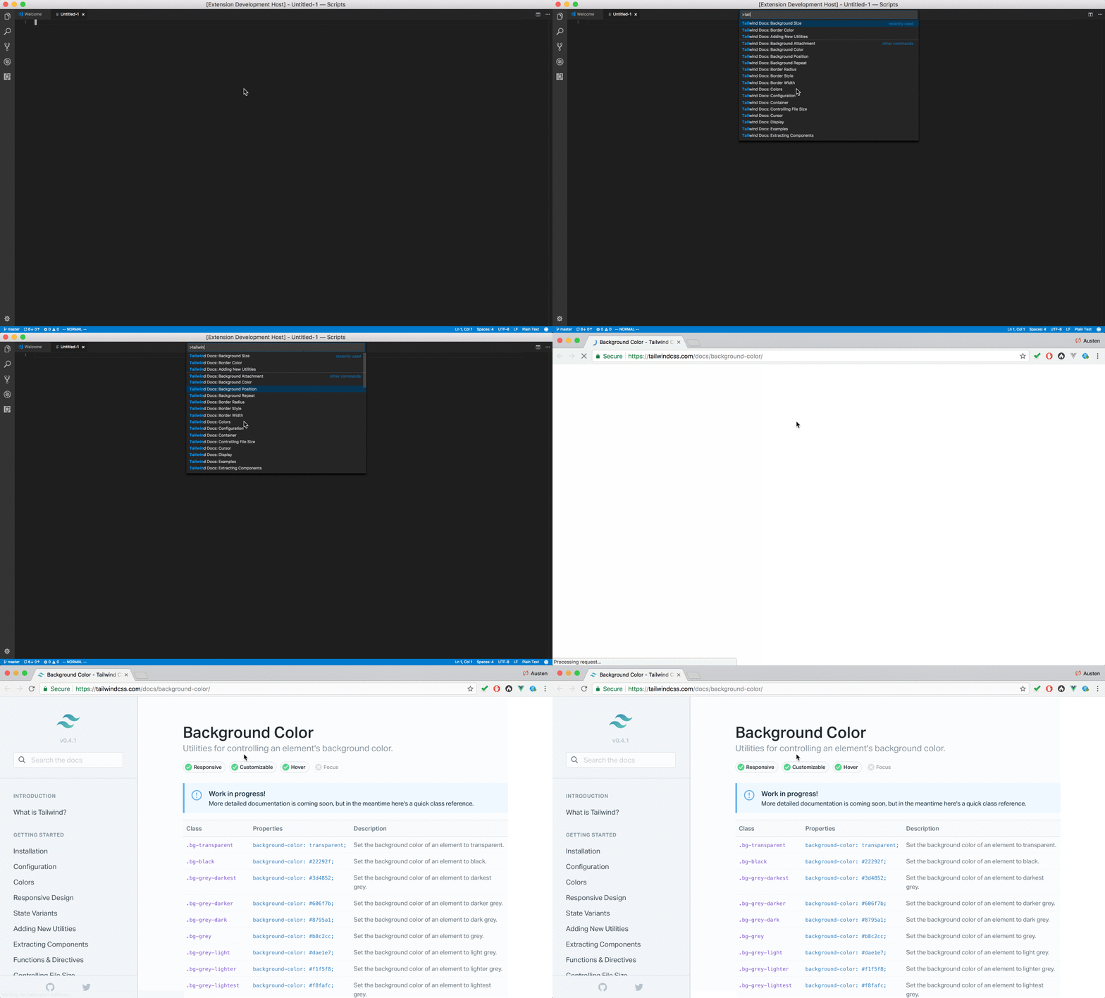
17. Tailwind Docs
Tailwind Docs is an unofficial Tailwind CSS extension that will help you to explore Tailwind CSS documentation from VSCode.
Do you have other Tailwind CSS tips & tricks?
If you know any tip or trick that isn’t shared here, please do not hesitate to share it in the comment below. Sharing is caring :smile:
Thank you, have a nice day!


