There are many kinds of data to be shown in a web application. One of them is statistical data which is usually using graph to show it. In web technology, showing data in dinamic and flexible graph initially seem difficult.
However, with the recent web technology, displaying statistical data using dinamic graph become easy. With the combinations of Jquery, CSS and HTML5 Canvas, you can do it all easily.
In this post, i will show you how to display data using Flat-styled graph. But this time i am not code it myself. So i just tell you about how to install HTML5 graph in your web using Flat Chart template form w3layouts.com 
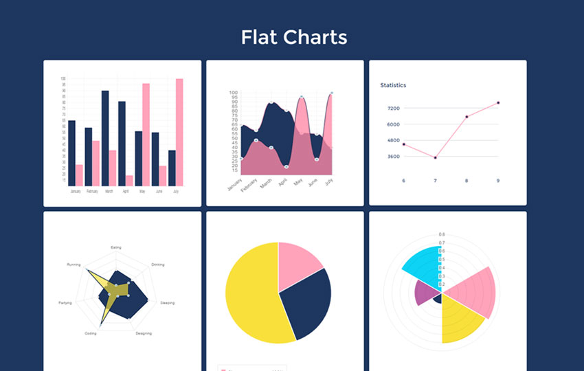
As you see in the image above, there are six graphs that you can use. All of them is flat-styled. Just see the demo and download the file. Then, extract and open it in the text editor. We will discuss how to install it step by step.
Step 1
Make sure you include the latest jquery library, chart.js and style.css that can be found in the bundle you just downloaded. And it is Likewise with the font if you want use the same font as demo.
<link href="path/to/css/style.css" rel="stylesheet" type="text/css" /> <script src="path/to/js/jquery-1.11.1.min.js"></script> <script src="path/to/js/Chart.js"></script>
<link href="//fonts.googleapis.com/css?family=Montserrat:400,700" rel="stylesheet" type="text/css">
– The red codes is URL location that you should be adjusted based on where the file located. – The green codes use to include the font. It is optional to use. Include it if you want use the same font as demo.
Step 2
After all script requirements included, now is the time to install one of the graph in your HTML markup. For each graph, the HTML markup and its configuration can be seen below.
Type 1 – Bar Chart
<div class="graph"> <canvas id="canvas" height="350″ width="600″></canvas> <script> var barChartData = { labels : \["January","February","March","April","May","June","July"\], datasets : \[ { fillColor : "rgba(9, 35, 78, 0.91)", strokeColor : "rgba(9, 35, 78, 0.91)", data : \[65,59,90,81,56,55,40\] }, { fillColor : "rgba(255, 137, 167, 0.78)", strokeColor : "rgba(255, 163, 186, 0.93)", data : \[28,48,40,19,96,27,100\] } \] } var myLine = new Chart(document.getElementById("canvas").getContext("2d")).Bar(barChartData); </script> </div>
Type 2 – Line Chart 1
<div class="graph"> <div class="month-graph effect21″> <canvas id="line" height="300″ width="300″ style="width:300px; height: 300px;"></canvas> <script> var lineChartData = { labels : \["January","February","March","April","May","June","July"\], datasets : \[ { fillColor : "rgba(9, 35, 78, 0.91)", strokeColor : "rgb(255, 137, 167)", pointColor : "rgba(220,220,220,1)", pointStrokeColor : "#fff", data : \[65,59,90,81,56,55,40\] }, { fillColor : "rgba(255, 137, 167, 0.78)", strokeColor : "rgba(9, 35, 78, 0.91)", pointColor : "rgba(151,187,205,1)", pointStrokeColor : "#fff", data : \[28,48,40,19,96,27,100\] } \] } var myLine = new Chart(document.getElementById("line").getContext("2d")).Line(lineChartData); </script> </div> </div>
Type 3 – Line Chart 2
<div class="graph lost"> <div class="left-graph-info"> <div class="alert-close4″></div> <h3>Statistics</h3> <script src="js/jquery.flot.min.js"></script> <!–//graph–> <script> $(document).ready(function () { // Graph Data ##############################################
var graphData = \[{ // Returning Visits data: \[ \[6, 4500\], \[7,3500\], \[8, 6550\], \[9, 7600\], \], color: ‘#FFA3BA", points: { radius: 4, fillColor: ‘#1d365f" } } \]; // Lines Graph ############################################# $.plot($(‘#graph-lines"), graphData, { series: { points: { show: true, radius: 1 }, lines: { show: true }, shadowSize: 0 }, grid: { color: ‘#1d365f", borderColor: ‘transparent", borderWidth: 10, hoverable: true }, xaxis: { tickColor: ‘transparent", tickDecimals: false }, yaxis: { tickSize: 1200 } }); // Bars Graph ############################################## $.plot($(‘#graph-bars"), graphData, { series: { bars: { show: true, barWidth: .9, align: ‘center" }, shadowSize: 0 }, grid: { color: ‘#fff", borderColor: ‘transparent", borderWidth: 20, hoverable: true }, xaxis: { tickColor: ‘transparent", tickDecimals: 2 }, yaxis: { tickSize: 1000 } });// Graph Toggle ############################################ $(‘#graph-bars").hide(); $(‘#lines").on(‘click", function (e) { $(‘#bars").removeClass(‘active"); $(‘#graph-bars").fadeOut(); $(this).addClass(‘active"); $(‘#graph-lines").fadeIn(); e.preventDefault(); });$(‘#bars").on(‘click", function (e) { $(‘#lines").removeClass(‘active"); $(‘#graph-lines").fadeOut(); $(this).addClass(‘active"); $(‘#graph-bars").fadeIn().removeClass(‘hidden"); e.preventDefault(); });// Tooltip ################################################# function showTooltip(x, y, contents) { $(‘<div id="tooltip">" + contents + ‘</div>").css({ top: y – 16, left: x + 20 }).appendTo(‘body").fadeIn(); }var previousPoint = null;$(‘#graph-lines, #graph-bars").bind(‘plothover", function (event, pos, item) { if (item) { if (previousPoint != item.dataIndex) { previousPoint = item.dataIndex; $(‘#tooltip").remove(); var x = item.datapoint\[0\], y = item.datapoint\[1\]; showTooltip(item.pageX, item.pageY, y+ x ); } } else { $(‘#tooltip").remove(); previousPoint = null; } });}); </script> <!– Graph HTML –> <div id="graph-wrapper"> <div class="graph-container"> <div id="graph-lines"> </div> <div id="graph-bars"> </div> </div> </div> <!– end Graph HTML –> </div> </div>
Type 4
<div class="graph"> <canvas id="radar" height="400″ width="350″></canvas> <script> var radarChartData = { labels : \["Eating","Drinking","Sleeping","Designing","Coding","Partying","Running"\], datasets : \[ { fillColor : "rgba(9, 35, 78, 0.91)", strokeColor : "rgba(9, 35, 78, 0.91)", pointColor : "rgba(220,220,220,1)", pointStrokeColor : "#fff", data : \[65,59,90,81,56,55,40\] }, { fillColor : "rgba(249, 224, 59, 0.65)", strokeColor : "rgba(9, 35, 78, 0.91)", pointColor : "rgba(151,187,205,1)", pointStrokeColor : "#fff", data : \[28,48,40,19,96,27,100\] } \]}var myRadar = new Chart(document.getElementById("radar").getContext("2d")).Radar(radarChartData,{scaleShowLabels : false, pointLabelFontSize : 10}); </script> </div>
Type 5 – Pie Chart 1
<div class="graph"> <canvas id="pie" height="400″ width="300″></canvas> <div class="legend"> <div id="os-Win-lbl">Chrome <span>100%</span></div> <div id="os-Mac-lbl">Internet Explorer <span> 50%</span></div> <div id="os-Other-lbl">Safari<span>30%</span></div> </div> <script> var pieData = \[ { value: 30, color:"#FFA3BA" }, { value : 50, color : "#1d365f" }, { value : 100, color : "#f9e03b" } \];var myPie = new Chart(document.getElementById("pie").getContext("2d")).Pie(pieData); </script> </div>
Type 6 – Pie Chart 2
<div class="graph lost1″> <canvas id="polar" height="400″ width="350″></canvas> <script> var chartData = \[ { value : Math.random(), color: "#1d365f" }, { value : Math.random(), color: "#FFA3BA" }, { value : Math.random(), color: "#f9e03b" }, { value : Math.random(), color: "#1d365f" }, { value : Math.random(), color: "#bb62a6" }, { value : Math.random(), color: "#0dd3f4" } \]; var myPolarArea = new Chart(document.getElementById("polar").getContext("2d")).PolarArea(chartData); </script> </div>
The all of data presented above surely are the fake data that generated just for demo. Therefore, you have to replace them with the real data from database using serverside script like PHP.
The red codes above are the code for graph contents and its configuration. You have to integrate them to database so the data shown is real.
Good luck 🙂 Have a question ? ask that in the comment below!

![How to Show Data Using Graph with HTML5 Canvas [Flat Chart Template]](/_astro/flat_charts.dcSawHfK_Wpdwi.webp)