React datepicker library is one of the most used libraries in React applications. It helps developers to create interactive UI for date input, datetime input, date range input, etc.
There are a lot of datepicker libraries for React out there. But, picking one that suits your project needs is not easy because each datepicker library has different features.
In this post, I will review the 2 most popular React datepicker libraries (react-datepicker and react-day-picker) and show you how to use them as well.
Actually, there was another library that I want to be included here. It was react-dates. But, when I tried and do some experiment with it, I got some error that made me debugging for almost 3 hours.
react-dates using install-peerdeps for installing its peer dependencies that are outdated. It caused my React version downgrading to 16.1, so I can’t use Hooks in that version.
It was a good and popular library, especially if you want to create a date range input. But because of what I explained above, and some other drawbacks, I decided to exclude it here.
~~~
Before we begin, I assume that you’re already know how to initialize a react project using create-react-app because I won’t explain it anymore.
I also use functional component and Hooks to manage state in the component as it is more simple and cleaner than using class-based component.
How to Implement Datepicker using react-datepicker
React-datepicker is the most used and popular datepicker library for reactjs. It is simple, easy to use, well-documented and rich of features.
react-datepicker can be used for date input, datetime input, date range input, time input, year month input, year input, month input, etc. It has a ton of attribute that helps you to customize your date input.
This library should be your first choice if you need to implement date or similar input to your react application.
Installing and Importing react-datepicker
Installing react-datepicker is simple. Just run the following npm command in your project folder through terminal:
npm install react-datepicker --saveOr use this command if you use yarn
yarn add react-datepickerWait until the npm or yarn download and install it to your project.
To use it in component, you have to import react-datepicker and its style like this:
import DatePicker from 'react-datepicker';
import 'react-datepicker/dist/react-datepicker.css';
Now, you’re ready to use react-datepicker in component. Let me show you some usage exampes below.
Basic Date Input Example
A simple datepicker is a very common UI in any application. With react-datepicker you can easily create it like this:
import React, { useState } from 'react';

import DatePicker from 'react-datepicker';
import 'react-datepicker/dist/react-datepicker.css';

export default function ReactDatepicker() {
	const [basicDate, setBasicDate] = useState(new Date());
	return (
		<div>
			<DatePicker selected={basicDate} onChange={(date) => setBasicDate(date)} />
		</div>
	);
}
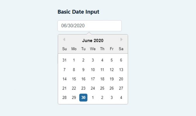
Don’t forget to create a state to store date data, so you can use it later. The code above will result a datepicker as shown in the image below. I simplified the codes by removing unimportant markups.

For this basic datepicker, you only need 1 markup <DatePicker/> and 2 attributes: selected for the selected date and onChange to handle date change event.
Date and Time Input Example
If you want to create a datetime picker, you can also do that with react-datepicker.
import React, { useState } from 'react';

import DatePicker from 'react-datepicker';
import 'react-datepicker/dist/react-datepicker.css';

export default function ReactDatepicker() {
	const [dateTime, setDateTime] = useState(new Date());
	return (
		<div>
			<DatePicker
				selected={dateTime}
				onChange={(date) => setDateTime(date)}
				showTimeSelect
				timeFormat='HH:mm'
				timeIntervals={15}
				timeCaption='time'
				dateFormat='MMMM d, yyyy h:mm aa'
			/>
		</div>
	);
}
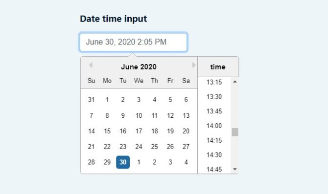
There are more attributes to create a datetime picker. You still have to include selected and onChange attributes. The other attributes like showTimeSelect, timeFormat, timeIntervals, timeCaption, dateFormat are also needed.
The datetime picker will looks like the image below.
Date Range Input Example
Sometimes, a project needs a date range input for a certain case. With react-datepicker you can create that like this:
import React, { useState } from 'react';

import DatePicker from 'react-datepicker';
import 'react-datepicker/dist/react-datepicker.css';

export default function ReactDatepicker() {
	const [startDate, setStartDate] = useState(new Date('2020/07/01'));
	const [endDate, setEndDate] = useState(new Date('2020/07/07'));
	return (
		<div>
			<div className='row'>
				<div className='col-md-4'>
					<DatePicker selected={startDate} onChange={(date) => setStartDate(date)} selectsStart startDate={startDate} endDate={endDate} />
				</div>
				<div className='col-md-4'>
					<DatePicker
						selected={endDate}
						onChange={(date) => setEndDate(date)}
						selectsEnd
						startDate={startDate}
						endDate={endDate}
						minDate={startDate}
					/>
				</div>
			</div>
		</div>
	);
}
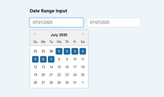
You will need 2 <DatePicker/> for start and end date, as well as their states. Beside selected and onChange attributes, selectsStart, selectsEnd, startDate, and endDate also required for date range input. While minDate can be used to set a minimum date that can be selected in the range.
The date range input will looks like this.
Putting It All Together in the Form
When we talk about input, then we will also talk about form. The previous examples show you how to use react-datepicker individually. Now, i will show you how to use them in a form, putting all of them together.
import React, { useState } from 'react';

import DatePicker from 'react-datepicker';
import 'react-datepicker/dist/react-datepicker.css';

export default function ReactDatepicker() {
	const [basicDate, setBasicDate] = useState(new Date());

	const [dateTime, setDateTime] = useState(new Date());

	const [startDate, setStartDate] = useState(new Date('2020/07/01'));
	const [endDate, setEndDate] = useState(new Date('2020/07/07'));

	const handleSubmit = (e) => {
		e.preventDefault();
		// Sample postBody request
		const postBody = {
			basicDate: basicDate,
			dateTime: dateTime,
			startDate: startDate,
			endDate: endDate
		};

		console.log(postBody);
		alert('Open your devtools - console tab');
	};

	return (
		<div>
			<form method='post' onSubmit={handleSubmit}>
				<div className='section'>
					<h3 className='section-title'>Basic Date Input</h3>
					<div className='section-content'>
						<DatePicker selected={basicDate} onChange={(date) => setBasicDate(date)} />
					</div>
				</div>

				<div className='section'>
					<h3 className='section-title'>Date time input</h3>
					<div className='section-content'>
						<DatePicker
							selected={dateTime}
							onChange={(date) => setDateTime(date)}
							showTimeSelect
							timeFormat='HH:mm'
							timeIntervals={15}
							timeCaption='time'
							dateFormat='MMMM d, yyyy h:mm aa'
						/>
					</div>
				</div>

				<div className='section'>
					<h3 className='section-title'>Date Range Input</h3>
					<div className='section-content'>
						<div className='row'>
							<div className='col-md-4'>
								<DatePicker
									selected={startDate}
									onChange={(date) => setStartDate(date)}
									selectsStart
									startDate={startDate}
									endDate={endDate}
								/>
							</div>
							<div className='col-md-4'>
								<DatePicker
									selected={endDate}
									onChange={(date) => setEndDate(date)}
									selectsEnd
									startDate={startDate}
									endDate={endDate}
									minDate={startDate}
								/>
							</div>
						</div>
					</div>
				</div>

				<div className='section'>
					<button className='btn btn-submit'>Submit Form</button>
				</div>
			</form>
		</div>
	);
}
In the code above, I put and wrap the previous code examples in a form tag. The form listens to a submit event through onSubmit attributes. When you submit the form by clicking a Submit form button, it will trigger handleSubmit function where you put some logic there, such as API calling.
In the example above, I created handleSubmit function only to log the state from different input in a JSON object and trigger a native JS alert. To see how it works, you can click the live demo link below.
If you want to download the codes and experiment with it locally, you can clone or download this repository on Github.
That repository does not only contain the code examples for this tutorial. It also contains the demos for other tutorials I made on this blog. Feel free to use it and don’t forget to give it a star.
Other Useful Features
What I show you above are only basic features of react-datepicker. If you want to customize it or explore the other features, you can go to react-datepicker official website.
To name a few, the other react-datepicker features are individual time, year and month picker, custom time input, localization, multiple months picker, etc. You can implement them by adding some attributes to <DatePicker/>
How to Implement Datepicker using react-day-picker
In case you don’t fit with react-datepicker for whatever reasons, I give you another option to handle date input in your project.
react-day-picker is a flexible, highly customizable, localizable, and lightweight datepicker library with ARIA support and no external dependencies.
It’s quite different from react-datepicker that rely on the input field with a pop-up calendar to pick a date. react-day-picker is more like a calendar-based datepicker.
It doesn’t have many options with datepicker input field. It also doesn’t support date time and time picker. But it can give you a lot options if you need a calendar input on your project.
Now, let’s go to the technical things.
Installing and Importing react-day-picker
Installing react-day-picker is also simple. Just run the following npm command in your project folder through terminal:
npm install react-day-picker --saveOr run this command if you use yarn
yarn add react-day-pickerWait until the npm or yarn download and install it to your project. After it finished, you can implement the examples below.
But first, you have to import it in your component. The basic import will be like this.
import DayPicker from 'react-day-picker';
import 'react-day-picker/lib/style.css';
If you want to use DayPicker with input field, you shoud also import DayPickerInput.
import DayPickerInput from 'react-day-picker/DayPickerInput';Basic Calendar Example
This is similar to basic date input, but it is using calendar UI instead of input field.
import React, { useState } from 'react';

import DayPicker from 'react-day-picker';
import 'react-day-picker/lib/style.css';
import './style.scss';

export default function ReactDayPicker() {
	const [basicCalendarDate, setBasicCalendarDate] = useState(new Date());
	return (
		<div>
			<DayPicker
				onDayClick={(date) => {
					setBasicCalendarDate(date);
				}}
				selectedDays={basicCalendarDate}
			/>
		</div>
	);
}
To create basic calendar datepicker using react-day-picker, you can use <DayPicker/> with onDayClick attribute to handle date change event and selectedDays attribute to store selected date. You should also create a react state to store date data.
The UI will look like this. Don’t mind with the labels above/below the calendar.
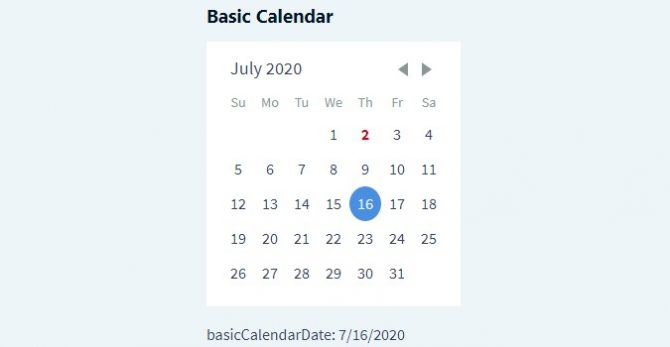
In this example, i also put some style to give a white background color for the calendar because the original one is transparent.
Calendar Date Range Example
react-day-picker also can handle date range input. In fact, you have 2 options for this. You can create a date range with calendar and date range with input field.
But here, I will only show a calendar date range example. if you want date range with input, you can see it here in the official example.
import React, { useState } from 'react';
import DayPicker, { DateUtils } from 'react-day-picker';
import 'react-day-picker/lib/style.css';

export default function ReactDayPicker() {
	const [from, setFrom] = useState(undefined);
	const [to, setTo] = useState(undefined);
	return (
		<div>
			<DayPicker
				numberOfMonths={2}
				selectedDays={[from, { from, to }]}
				onDayClick={(date) => {
					const range = DateUtils.addDayToRange(date, { from, to });
					setFrom(range.from);
					setTo(range.to);
				}}
			/>
		</div>
	);
}
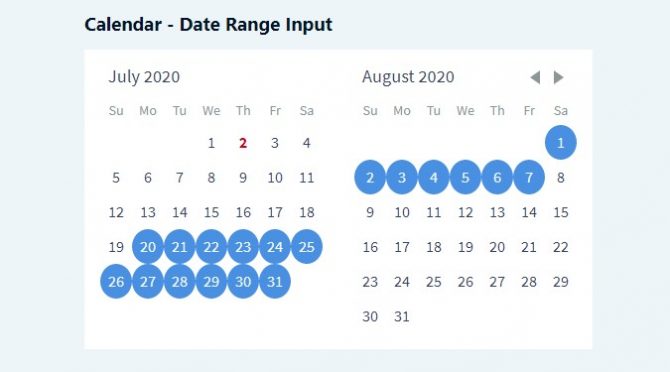
To implement date range input with react-day-picker, you don’t have 2 <DayPicker/> . You only need the same attributes you use to initialize a basic calendar, but with different values.
You can also add numberOfMonths to specify how many months do you want to show in the date range calendar.
In the code above, i use DateUtils.addDayToRange() to add new selected day to current date range. DateUtils contains some utilities to help you customize react-day-picker.
The UI for calendar date range, will looks like this.
Basic Datepicker with Input Field
If you still want to use datepicker with input field with react-day-picker, you can do it like this.
import React, { useState } from 'react';
import DayPickerInput from 'react-day-picker/DayPickerInput';
import 'react-day-picker/lib/style.css';

export default function ReactDayPicker() {
	const [basicInputDate, setBasicInputDate] = useState(new Date());
	return (
		<div>
			<DayPickerInput onDayChange={(day) => setBasicInputDate(day)} value={basicInputDate} />
		</div>
	);
}
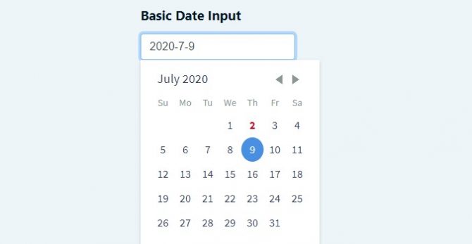
As you see above, it’s quite similar to react-date-picker if you want to create datepicker input with react-day-picker. The different are just attribute names and the component name.
You don’t have to import DayPicker because it has wrapped inside DayPickerInput. You need onDayChange attribute to handle date change event, and value to show selected date in the input field.
The UI for DayPickerInput will look like this.
If you want to see the live demo of react-day-picker examples above, you can click the demo link below.
If you want to download the codes and experiment with it locally, you can clone or download this repository on Github.
Other Features
There are still a lot of features on react-day-picker you can explore in the official documentation. react-day-picker is also support localization, week selection/picker, custom calendar navigation, week numbers, multiple days, etc.
Actually, I was trying to show you how to use multiple days picker here. But, I can’t show it with a functional component and Hooks right now.
In the official example, they use a class-based component to show the multiple days usage example. When I tried to convert it to functional component and use Hooks, I found a bug.
The date change only triggered when I navigate to next month and back to the selected month. So, I think it isn’t compatible with Hooks and I don’t want to force to use class-based component just to implement that.
If you want to use multiple days picker, you can follow the official example I linked before.
Conclusion
You can implement datepicker in your project with the library you choose. Make sure it’s suitable and fulfill your project requirements. You still have to do some experiments if you want to customize it. Just follow the official documentation. In case you get stuck, you can ask me in the comment below.
If these 2 libraries don’t fit with you, there are still a lot of libraries out there. If you found other good datepicker libraries that are not included here, please let me know through the comment below so I can review them. I might want to add one or some of them here.
Happy coding!

