Hi everyone, I’m back to write articles and tutorials again in my blog as i used to a couple years ago :smile:
In this post, I’m going to share about my current work, building Paradise UI - an opensource React UI component library. I will share anything about the tech stack i use, architecture, versioning, packaging and all i know so far about building an open source react ui component library.
This project is still in early stages, so you might find some codes that not implemented with best practices. Its going to be my long term project where i continue learn new things.
So, without further ado…
What is Paradise UI?
Paradise UI is a React UI component library that you can install to your project through npm. A React UI component library is an open source library that collects a set of reusable components that can be used in your React project, so you dont have to build it on your own.
If you know Material UI, Chakra UI or Primereact, those are react UI component libraries.
Paradise UI is designed to be:
- Simple & Easy to use. So that even a React newbie can use it easily.
- Headless. The components can be 100% unstyled, and you can apply your own css style.
- Modular. Each component can be installed independently. If you only need a custom Text Field component, you can only install and use that component, without installing other components.
- Highly customizable. Each component can be customized with common component props, and element class generator, a function to modify the element class & ui logic inside the component.
Paradise UI does not aim to be another React UI library with an opinionated design system. The main focus of Paradise UI is creating as many reusable components as possible that can match and be used with any design style/system.
These are the available components in Paradise UI so far:
More componets are still in progress. (need help here :grin:)
How I Build Paradise UI
I build Paradise UI as open source library with MIT license using these tools & methodologies
Main Tech Stacks
- Typescript. All component are written in typescrips.
- React >=18. Won’t work in React 17 and below.
- Vite. As development server.
- Storybook. To showcase and manually test the components in different use cases.
- Sass. To style component default element class.
- Tailwindcss. To style component with tailwind element class.
- Vitest. For unit test (not used yet).
- Docusaurus. For documentation website.
Architecture
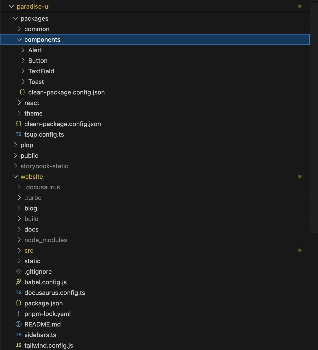
I build Paradise UI in Monorepo architecture, meaning that the project contains multiple packages (package.json). All installable packages are placed inside packages folder. website package is placed outside package folder because its a private package for documentation website.

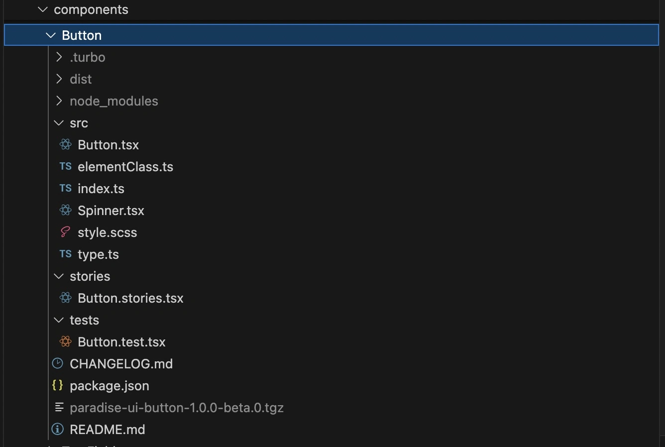
A component package folder consist of 3 folders:
src: contains the source codes for the component, usually consist ofindex.tsas entry point,type.ts,[Component].tsx,elementClass.tsandstyle.scssstories: contains*.stories.tsxfile that will be detected by storybook to showcase the component use casestests: contains unit test file

These folders and files can be generated with plop command pnpm plop component or pnpm create-component before creating new component.
I also use turbo build to build all the packages or running other npm commands at once.
Versioning
Paradise UI follow Semantic Versioning convention. Semantic versioning is a widely-adopted version scheme that encodes a version by a three-part version number (Major.Minor.Patch), for example version 1.1.1.
The patch version will be bumped when there is any change for bugfix or updating package dependencies.
The minor version will be bumped when the package updated for new features, without breaking the existing implementation. For instance, a user installed and implemented Alert component version 1.0.0 that has 2 props: variant and type. After a while, a new minor version 1.1.0 released with new prop color.
The user of version 1.0.0 can update the Alert component package to version 1.1.0, and then adding color to existing implementation without modifiying other props.
The major version will be bumped when the package updated for new features that break the existing implementation. In the above example, if the user is using version 1.0.0 and update the Alert component to version 2.0.0, they will have to reiimplement the component because the implementation in version 1.0.0 and version 2.0.0 will be different.
All these versioning management is done with Changesets library
Paradise UI in action
Now, let’s see how to implement Paradise UI in your project.
Installation
There are 2 ways to install Paradise UI components to your React project.
- Default Installation that will install whole packages of Paradise UI library.
# yarn
yarn add @paradise-ui/react

# or npm
npm install @paradise-ui/react

# or pnpm
pnpm add @paradise-ui/react- Standalone Component Installation that will only install a component package you need.
# yarn
yarn add @paradise-ui/alert

# or npm
npm install @paradise-ui/alert

# or pnpm
pnpm add @paradise-ui/alert
Change alert to your desired component
Usage
If you chose default installation, you have to wrap you project with <ParadiseUIProvider>. You also need to import the @paradise-ui/react/style for css file, because by default Paradise UI is unstyled.
import { ParadiseUIProvider } from "@paradise-ui/react";
import "@paradise-ui/react/style";

// Wrap your root application component (usually in App.jsx) with ParadiseUIProvider
function App({ children }) {
  return <ParadiseUIProvider>{children}</ParadiseUIProvider>;
}
export default App;
Then, you can use any Paradise UI component in your project.
import { Alert } from "@paradise-ui/react";

function PageComponent() {
  return <Alert variant="outlined">Paradise UI Alert Component</Alert>;
}
export default PageComponent;
For standalone installation, its a little bit different.
import { Alert } from "@paradise-ui/alert";
import "@paradise-ui/alert/style";

function PageComponent() {
  return <Alert variant="outlined">Paradise UI Alert Component</Alert>;
}
export default PageComponent;
Both codes will render the same result.
Contributing
As an open source library, Paradise UI is open for contribution. Although, to be honest i still figuring out how to manage it. Here are some works you can do if you’are interested to contribute.
Idea and Design new component
This is the work that i mostly need help with. I often spend time to trial and error some css style that actually dont really matter. If there are design guideline for each component, it will be very helpful.
Requirements:
- Experienced on designing UI component
Develop new component
Paradise UI has still a lot of components to work on. The main challenge here is to standardize component specification.
Requirements:
- Experienced and familiar with React >=18
- Experienced with storybook
- Able to work with Changesets
Write documentation for existing components
We still have a lot of works to write component documentation. Every component will be documented in format implemented in Alert component documentation
Requirements:
- Familiarity with markdown and mdx
Feedback
If you have any feedback for this project, feel free to write it in the comment box below. I’ll really appreciate it :smile:
Thank you, Have a good day!

