How to Create React Custom Input & Password Field (show/hide) in 5 minutes

In the previous post, I shared about how I built Paradise UI, a React component library with Monorepo architecture. I split the library into multiple independent component packages so everyone can pick and install only certain components based on their needs.
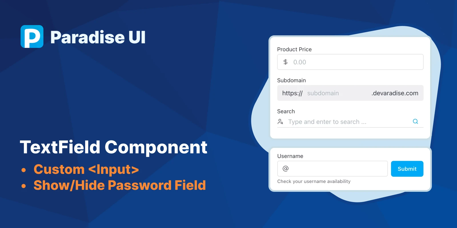
In this post, I’m going to share about the TextField component, the first component I made when I started Paradise UI. You might want to save or bookmark this for future reference.
In Paradise UI, TextField component is a native <input> component that is enhanced so it can be used for some use cases quickly, without having to manage the states or add css style.
Without further ado, let’s see how to implement it.
Installation & Basic Usage
Just pick one of the commands below based on your favorite package manager.
yarn add @paradise-ui/text-field
# or
npm i @paradise-ui/text-field
# or
pnpm i @paradise-ui/text-field
@paradise-ui/text-field export 1 component and 2 functions:
TextFieldcomponent itselfdefaultTextFieldElementClassa function that will generate default classes for all elements inside TextField componenttailwindTextFieldElementClassa function that will generate tailwind classes for all elements inside TextField component
Default usage
import { TextField } from '@paradise-ui/text-field';
import '@package-ui/text-field/style';

const ParentComponent = () => {
	return <TextField label='Lorem ipsum' />;
};
You need to import the style because all Paradise UI components are unstyled by default.
With Tailwind
import { TextField, tailwindTextFieldElementClass } from '@paradise-ui/text-field';

const ParentComponent = () => {
	return <TextField elementClass={tailwindTextFieldElementClass} label='Lorem ipsum' />;
};
If you are using Tailwindcss, you don’t need to import the style, but you have to add Paradise UI path into your Tailwindcss config.
/** @type {import('tailwindcss').Config} */
module.exports = {
  content: [
    ...,
    './node_modules/@paradise-ui/**/*.{js,ts}'
  ],
 ...
}
Although the documentation for this component is not ready, you can customize and change all props on this page.
Use cases
Now let’s see some use cases where you can implement TextField component
Size and Variants
TextField component come with 3 sizes (sm, md, lg) and 3 variants (outlined, filled, line). The default size is md and the default variant is outlined.
Size
Variants
<div class='flex flex-col gap-2 max-w-[370px] mx-auto'>
	<h3>Size</h3>
	<TextField size='sm' placeholder='Small text field' />
	<TextField placeholder='Medium text field' />
	<TextField size='lg' placeholder='Large text field' />
	<h3>Variants</h3>
	<TextField variant='line' placeholder='Line text field' />
	<TextField placeholder='Outlined text field' />
	<TextField variant='filled' placeholder='Filled text field' />
</div>
Input with Helper & Error message
Paradise UI TextField component also allows you to implement form validation logic and show error messages.
export const HelperAndErrorMessage = () => {
  const [errorMessage, setErrorMessage] = useState('');
  return (
    <form
      className='flex gap-2 items-center'
      onSubmit={(e) => {
        e.preventDefault();
        setErrorMessage('Username is already taken')
      }}
      >
      <TextField
        label='Username'
        prefix={<AtSign size={16} strokeWidth={1} />}
        errorMessage={errorMessage}
        helperText='Check your username availability'
        />
      <Button className='shrink-0' type='submit'>Submit</Button>
    </form>
  )
}
Input with Custom label
You can also pass a custom element or React component to label props to implement TextField component with a custom label.
<div class='flex flex-col gap-2 max-w-[370px] mx-auto'>
	<TextField
		label={
			<>
				<div className='font-bold'>Custom label</div>
				<small className='text-[var(--pui-text-secondary)]'>This is a custom label</small>
			</>
		}
		placeholder='Input placeholder'
	/>
</div>
Input with Custom icon, prefix & suffix
Like label, prefix, and suffix props are also able to accept custom elements, making them customizable.
Show/Hide Password Field
Showing and hiding password input can also be implemented by changing the type props upon clicking the custom suffix.
export const PasswordShowAndHide = () => {
  const [value, setValue] = useState('');
  const [visible, setVisible] = useState(false);
  return (
    <TextField
      label='Password'
      placeholder='Placeholder'
      type={visible ? 'text' : 'password'}
      value={value} onChange={value => setValue(value)} prefix={<Lock size={16} strokeWidth={1.5} />}
      suffix={
        <a className='cursor-pointer text-inherit flex items-center' onClick={() => setVisible(!visible)}>
          {visible ? <EyeOff size={16} strokeWidth={1.5} /> : <Eye size={16} strokeWidth={1.5} />}
        </a>
      }
    />
  )
}
Advanced Customization
Since all Paradise UI components are unstyled by default, you can entirely implement your custom style. You can refer to style.scss file before you write your custom css.
You can also change the element class by making a custom element class generator. Since I haven’t completed the documentation yet, you can refer to Alert customization documentation to create a custom element class.
Feedback
This component, along with another component in Paradise UI still in development. Feedback is greatly appreciated for the improvement of this project.
Please kindly give me feedback through a comment section below :smile:.
Thank you, have a good day.